Mindful Mobility is a patient-facing mobility app designed in collaboration with AdventHealth Avista, a hospital in Louisville, Colorado. The project addresses fall prevention for high-risk patients by reinforcing safe mobility behaviors while preserving patient autonomy during hospitalization.
Project Status
This project began as a five-person academic collaboration and is currently being continued by a two-person team, focused on incorporating clinician feedback and preparing the app for live patient usability testing.

Hospitalized patients with a risk of falling receive nurse provided care instructions but can struggle with confusing instructions, anxiety, and feeling a loss of independence. Meanwhile, nurses must care for high-risk fall patients while managing time-intensive workflows.
Objective:
Design a digital tool that supports patient independence and safety while fitting into nurse work flows.
My role
To understand existing problems within fall prevention research, our team conducted qualitative interviews with hospital staff and former patients to identify any potential pain points experienced within clinical settings.
My focus
Key research insights

We translated the insights from our research and user interviews into the following design principles that guided our team's future decisions:
Design principles
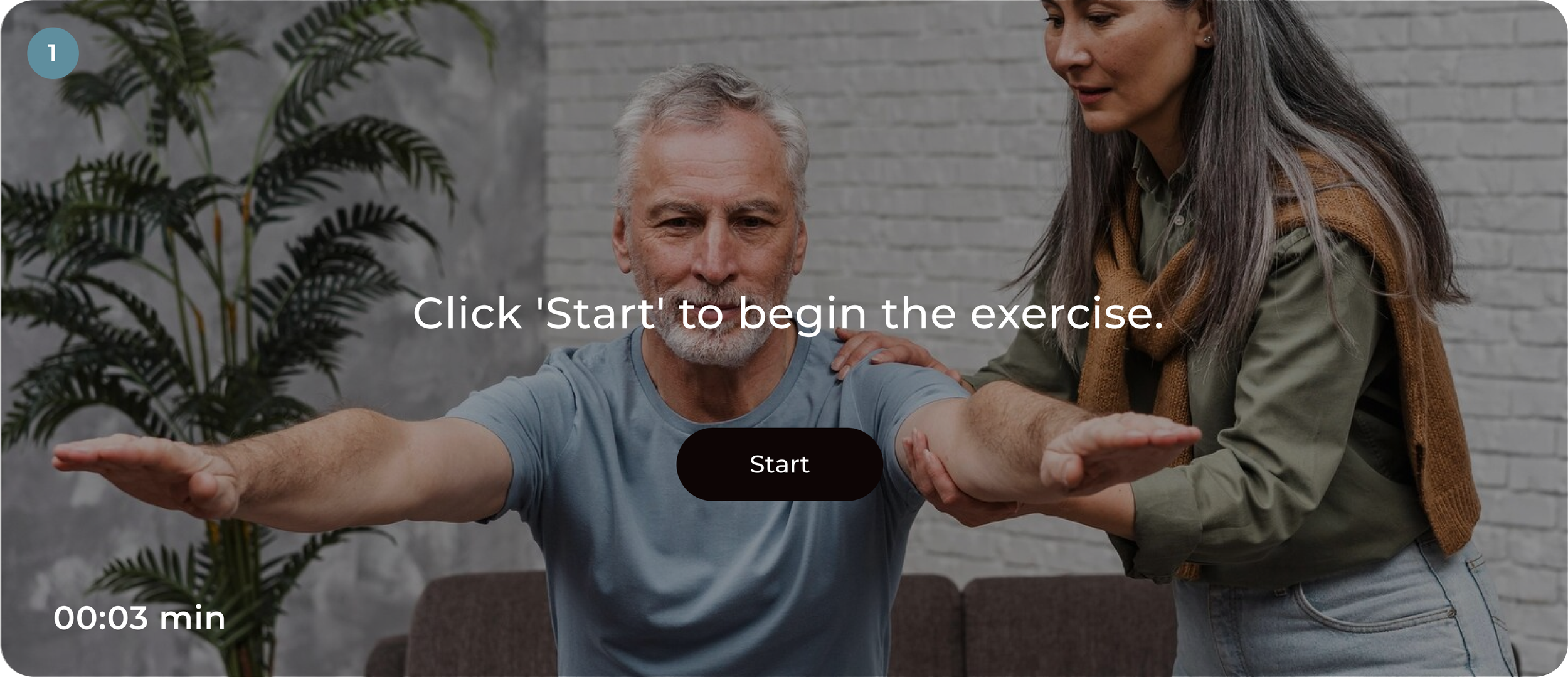
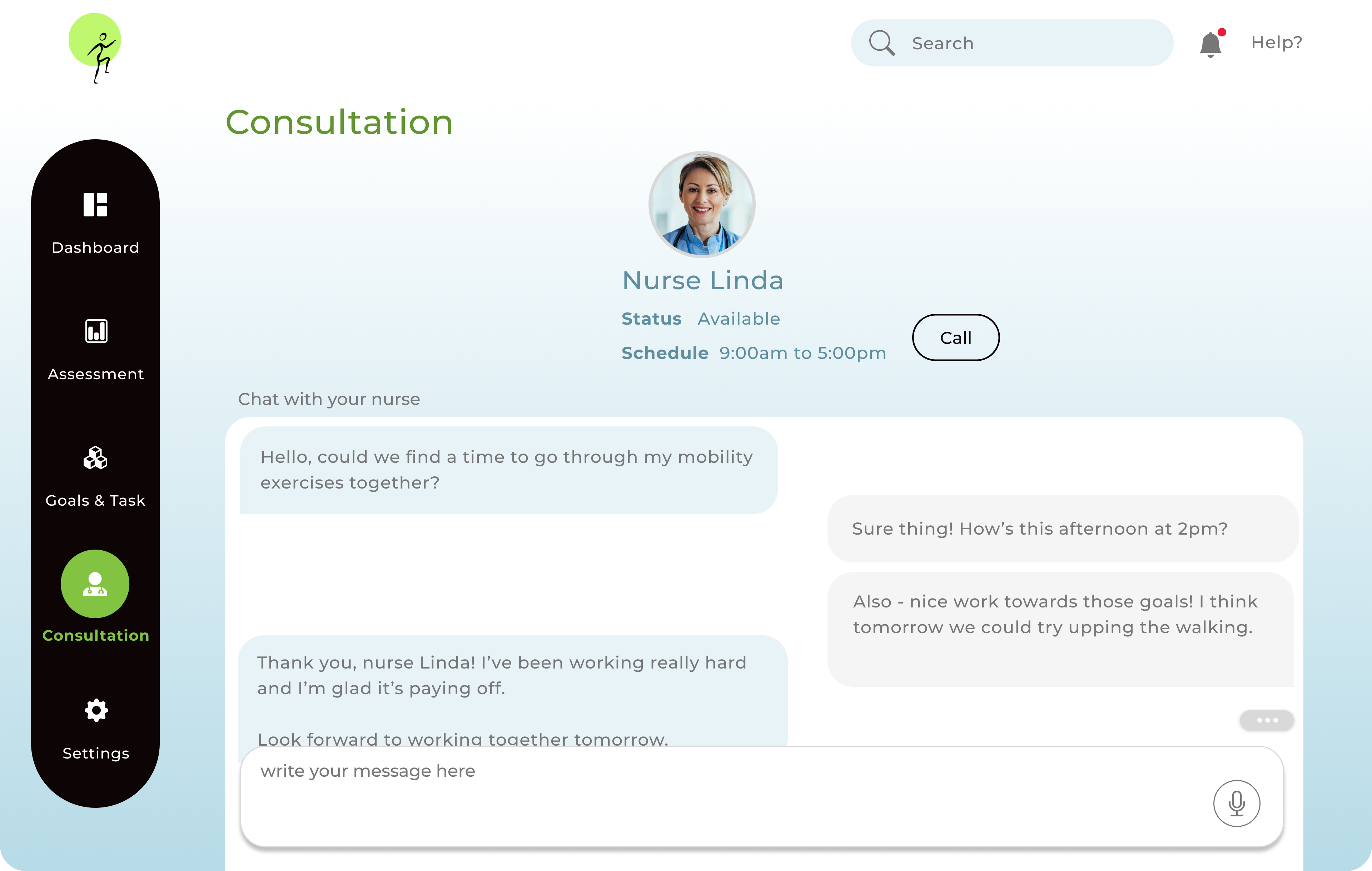
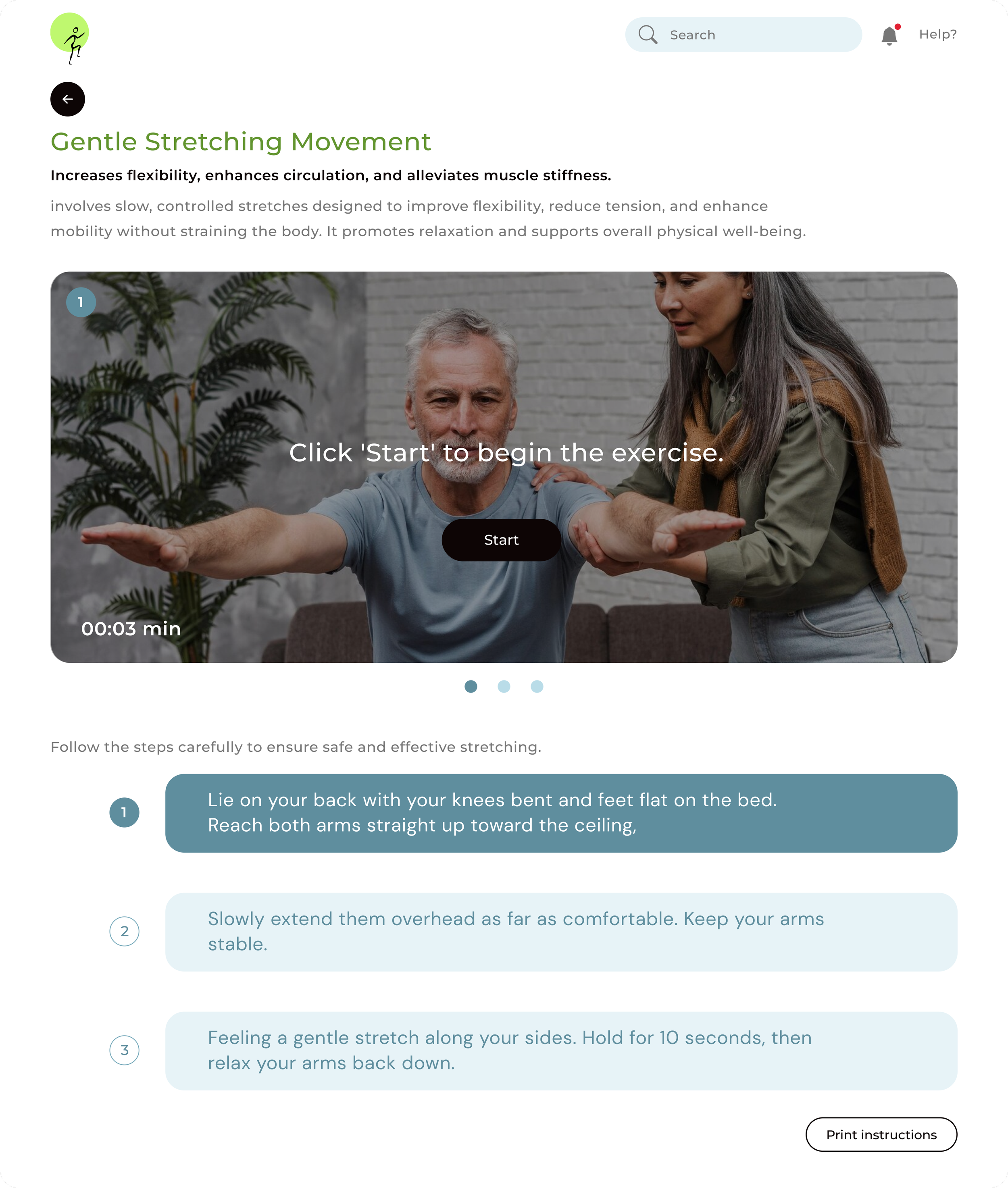
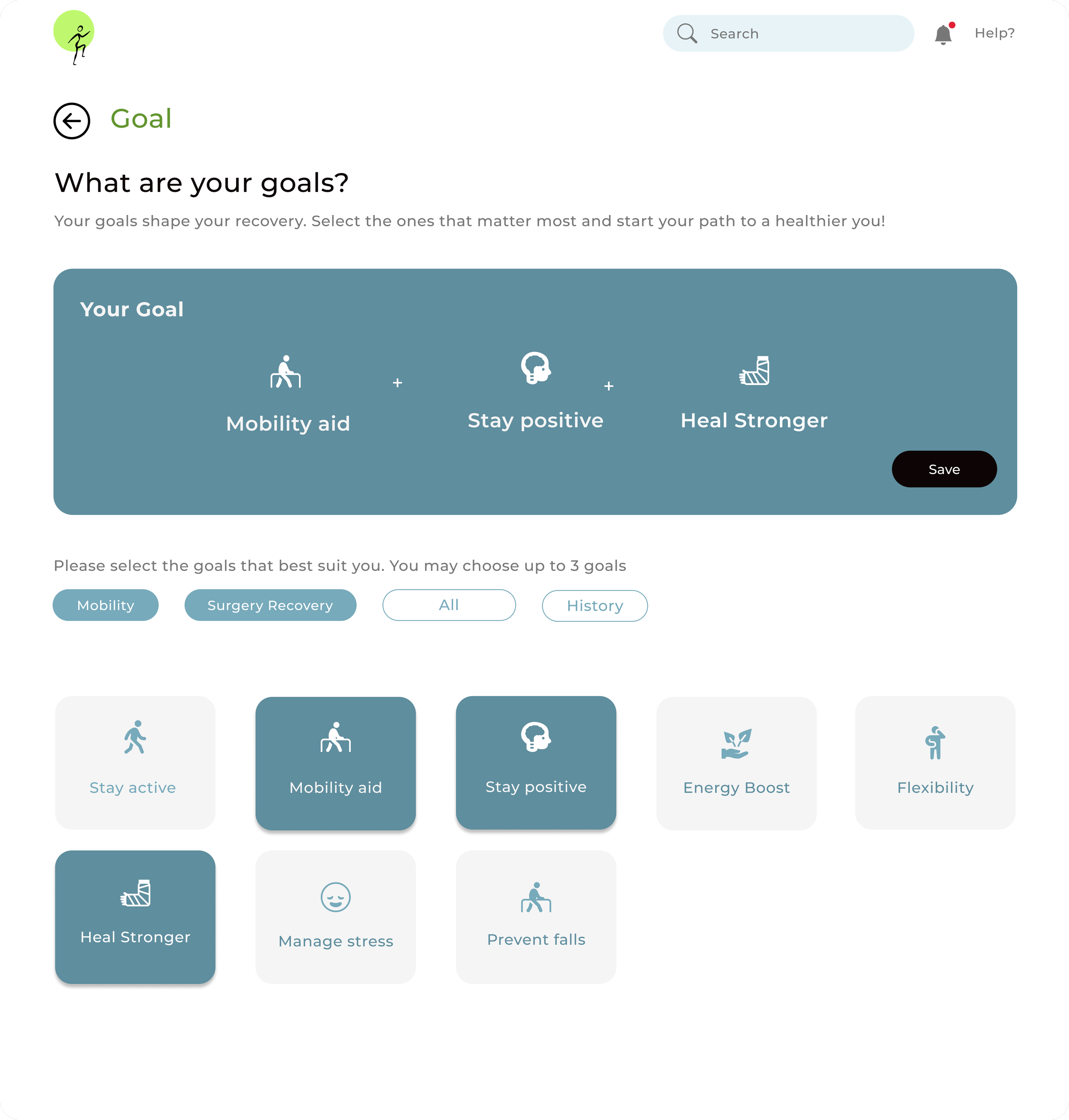
This framework helped our team prioritize features that were patient-centered, and avoided solutions that would create additional workloads for nurses. We designed and tested early app prototypes in Figma, with our initial concepts focusing on:
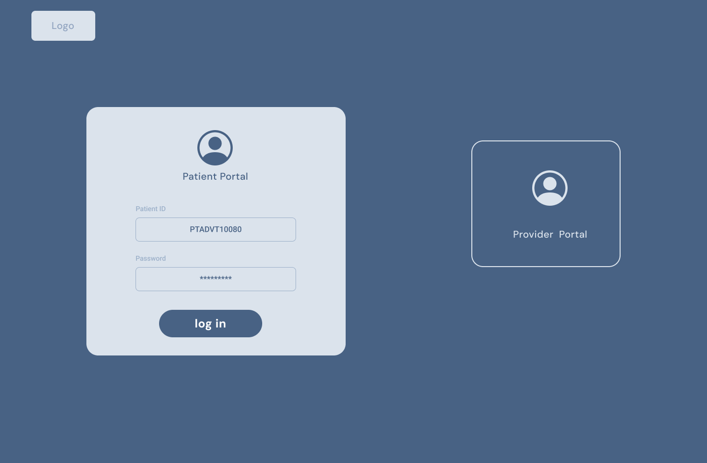
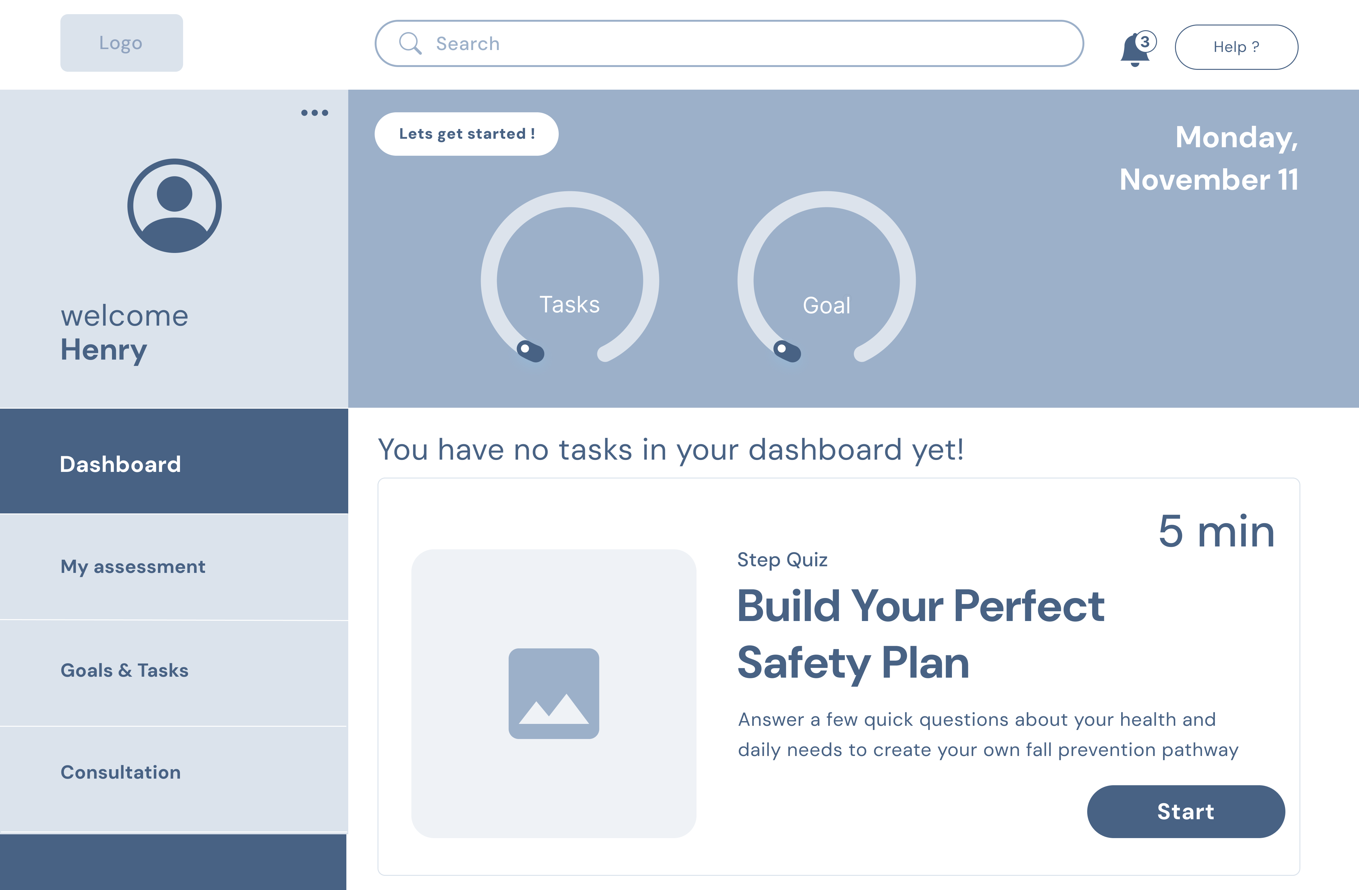
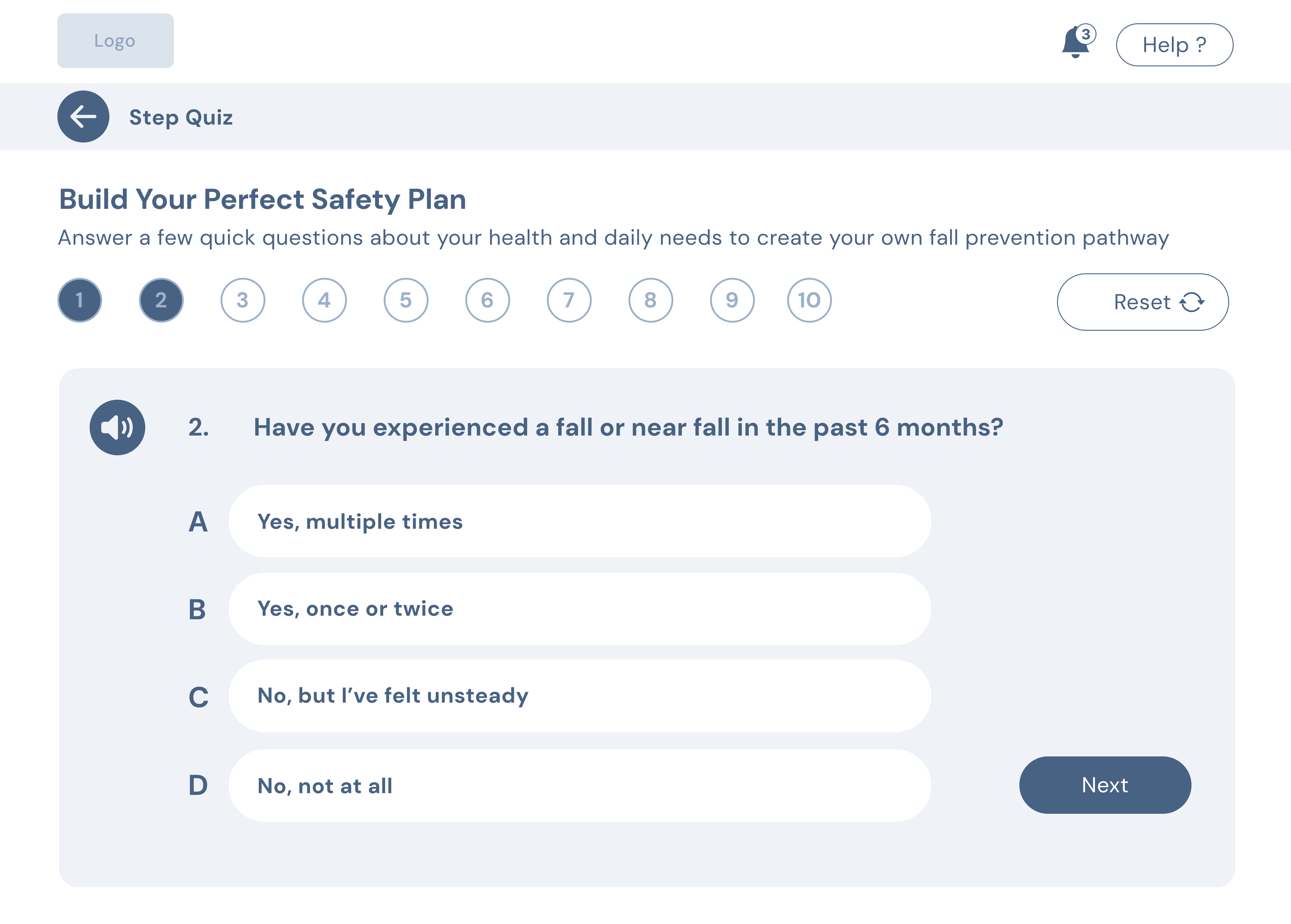
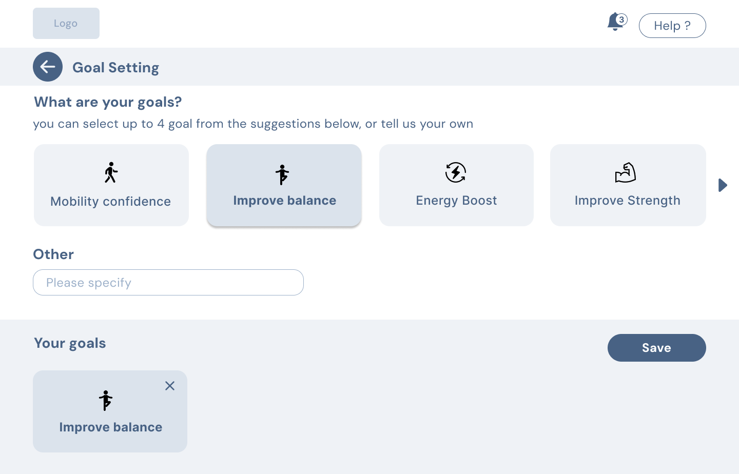
Throughout our design process we held regular meetings with the hospital staff to receive feedback on our feature prioritization. Once we completed the low-fidelity prototype, our team conducted on-site usability testing with AdventHealth's nursing manager and program director to evaluate app clarity, user navigation, and workflow fit.
What we heard
How the design evolved
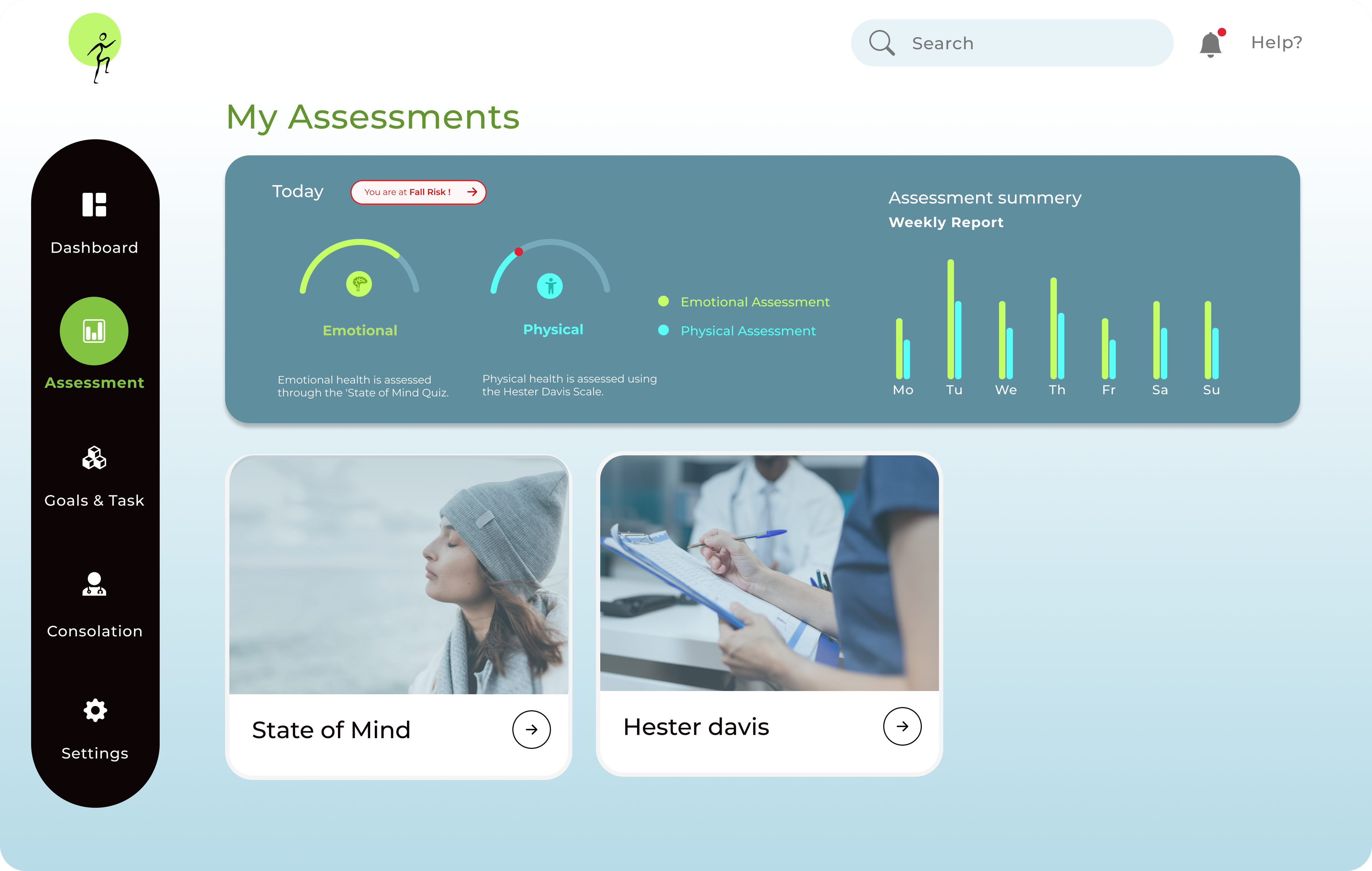
We conducted on-site testing with the nursing manager and program director at AdventHealth Avista to assess usability, accessibility, and feature relevance.
What we learned
Design iterations
Outcome & Next Steps
The project is currently being prepared for additional patient usability testing. We have incorporated a second round of clinician feedback to refine safety and clarity.