

Project Overview
This project was created for General Assembly’s UX course. Our task was to create a product using UX design and research methods. I choose a project to help DC area residents discover new restaurants through a more engaging food app. The solution was driven by user interviews, usability testing, and iterative design.
My Role
UX Design
User Research
Course
General Assembly UX Bootcamp
My Role
Figma
Photoshop
Course Length
August 29, 2022 - November 7, 2022
User Research
Initial Interviews
I conducted interviews with 4 users who used food apps 1–2 times a week to identify any gaps in their current experience.
Key Insights:
Frustrated by lack of neighborhood-specific info
Rarely explored new areas due to lack of incentives
Unsure what to search for; often defaulted to menus/reviews after deciding
2nd Round Interviews
A second round included 3 participants (1 returning, 2 new) to test feature concepts and refine direction.
Key Insights:
Users still struggled with food decisions
Users wanted guidance, not just lists of restaurants
Users desired clearer value propositions to try new spots
Design Goal
First Iteration: Improve discovery through better UI and enriched restaurant info pages.
Feedback: It wasn’t distinct enough — users needed a stronger hook.
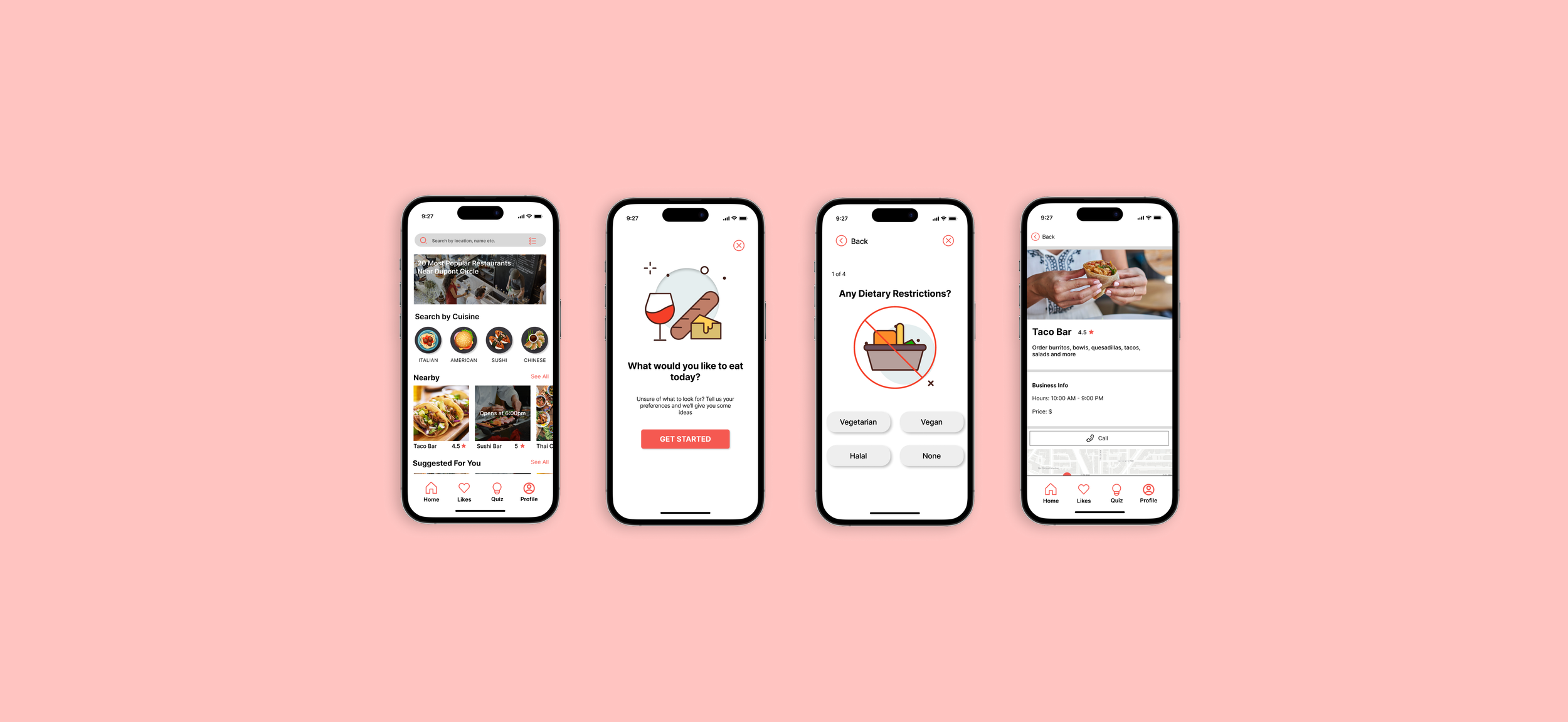
Second Iteration: Introduced a restaurant quiz feature to address the recurring pain point: “I don’t know what I want to eat.”
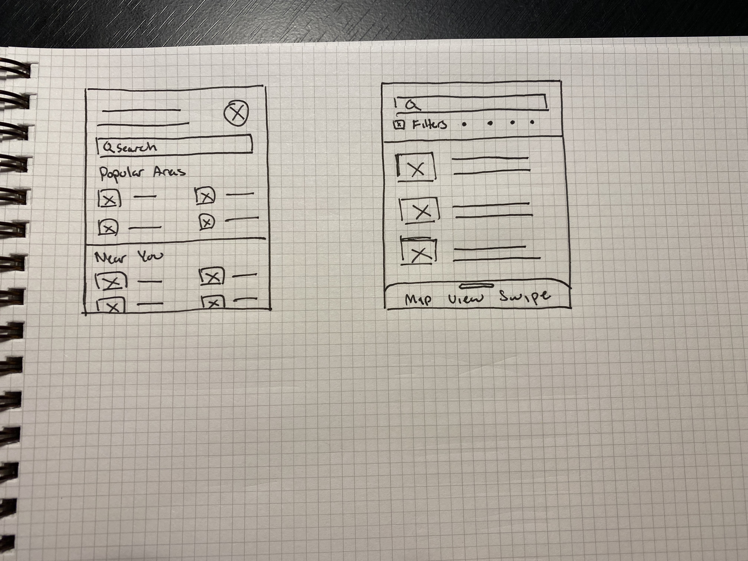
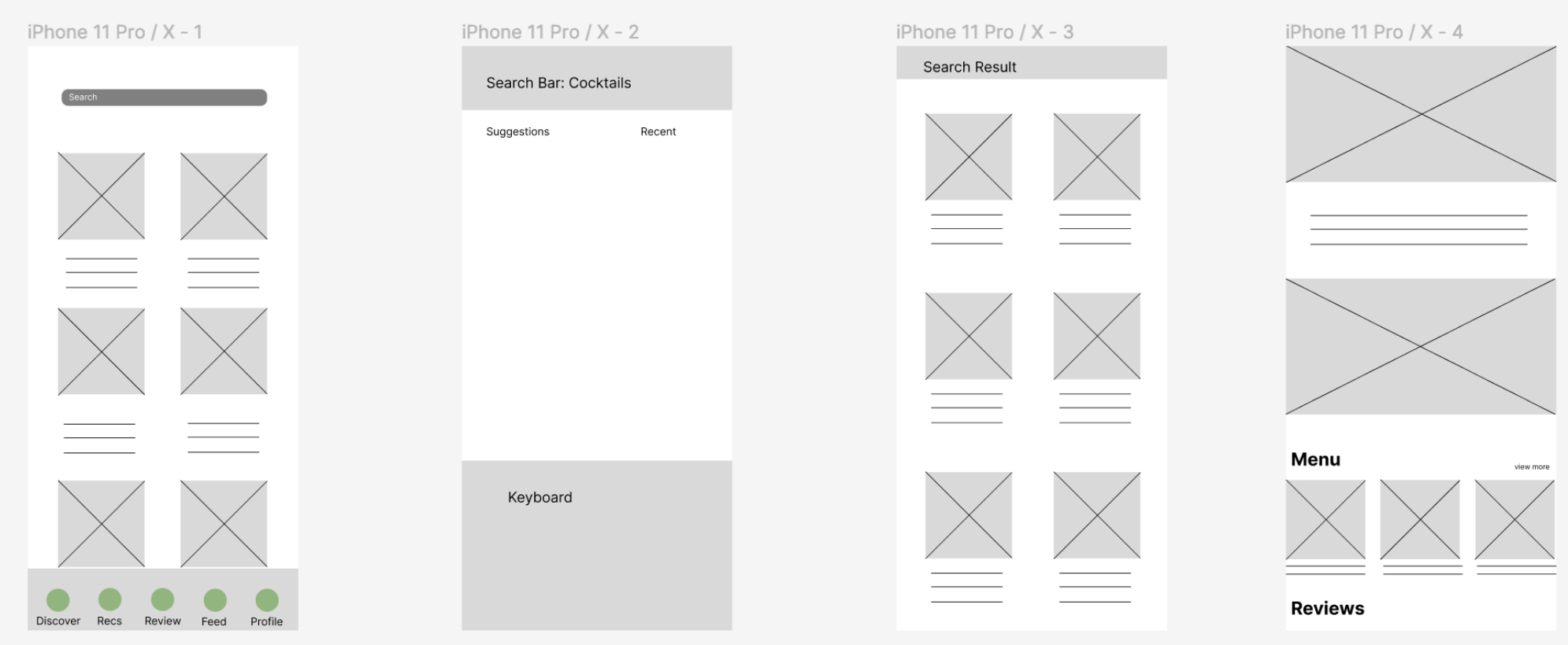
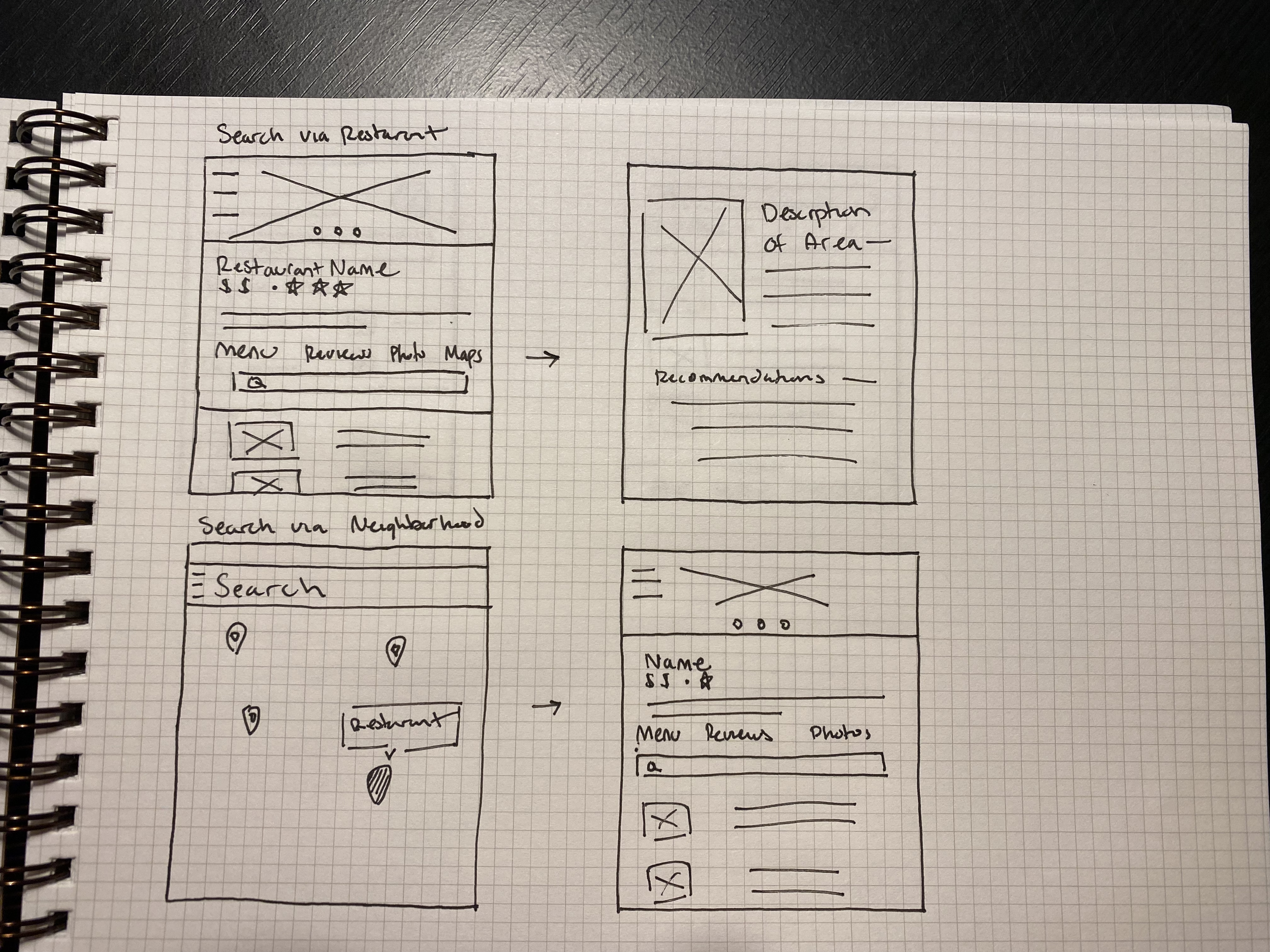
Wireframes & Prototyping
After completing interviews, I started designing paper sketches, then built low-fidelity wireframes in Figma to test layout and flow.
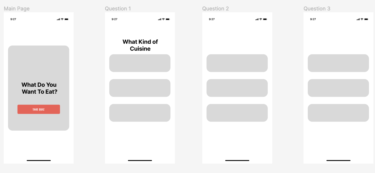
Key Feature: Restaurant Quiz
To reduce choice paralysis, a short quiz helps users filter restaurants based on mood, preferences, and desired experience — creating a personalized list to explore.
Usability Testing
Test 1
Goal: Assess basic navigation and task completion.
Findings:
Users misunderstood clickable areas
Avoided search bar; clicked on map or filter instead
Navigation wasn’t intuitive
Test 2
Similar issues surfaced, but participants articulated their decision-making better.
Findings:
Still avoided search bar due to uncertainty about what to search
Preferred browsing or filtering instead
Test 3
Improved performance, though users still hesitated before engaging clickable areas.
Revisions Based on Feedback
Added placeholder text in search bar with examples
Simplified navigation and visual cues
Introduced quiz feature to guide exploration
Removed redundant/confusing icons (e.g., “sort” vs. “filter”)
Outcome
The app now focuses on helping users make food decisions through a more personalized and intuitive experience — not just showing restaurants, but guiding them toward discovery.